Matt Inman - 0at.org - Marketing & Design
- ¤Home
- ¤Everything
- ¤About
- ¤Portfolio
- ¤Blog
How to Make Awesome Business Cards at Home
Posted on 1/2/08
While working at SEOmoz I was tasked with designing our corporate business cards. This was always terribly frustrating, not because of any wrongdoing on their part, but simply because I was always unhappy with how the cards turned out. I have very little experience with print design, and somewhere along the way my designs would always end up looking terrible in print. The type would look distorted, the colors were always off, and I even had several cases where elements came out improperly aligned when I got them back from the printer.
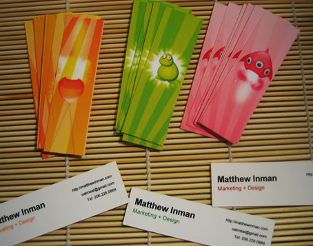
With pubcon coming up, I wanted to make some new business cards for myself that were unique, memorable, and looked good. I also didn't want them to be a standard size, but I didn't want to make them shorter than regular cards because I've had people give me cards like that before and it's irrtating. The smaller cards end up sinking down into the pocket of your wallet and you can't find them. They also don't stack very well with other cards. I figured printing cards that were half the size of a regular card (width-size) would do the trick. They basically turned out having similar dimensions to a stick of gum.
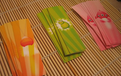
Initially I tried to order them from Moo.com, but I quickly realized they wouldn't show up in time before the conference, so I ended up printing them at home instead of sending them off to a print shop. I'm very happy with how they turned out:
Here's how I did it:
- I bought a decent color printer
- I got "clean edge" dual sided business card paper from Avery(8869).
- I bought an x-acto paper cutter. It's just small plastic device about the size of a ruler you can use to cut straight lines. You can find them at most office supply stores, I think the one I bought was around $7.99.
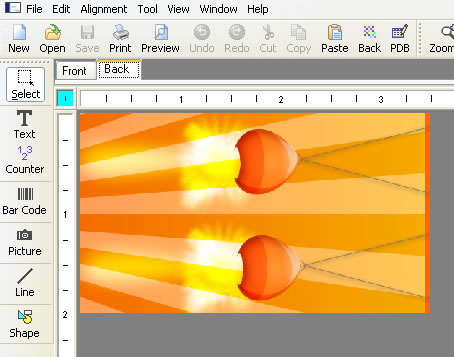
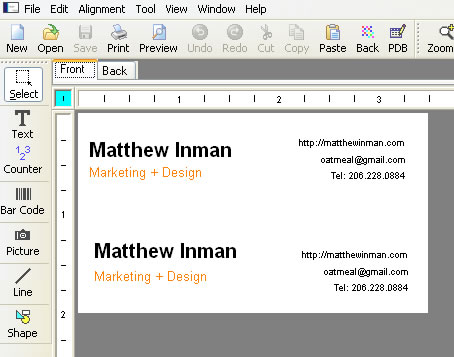
- I bought a copy of Business Card Designer Plus 9 ($29.00). It's a simple little program that dumbs down the process of printing business cards, including printing on dual sides and getting everything to align properly. Initially I tried a few free programs, including OpenOffice's business card templates but I couldn't get it to work.
From there it was simple, I just exported my designs as high-res JPEGs and re-imported them into the business card software. I printed doubles of everything and then sliced them up using the x-acto knife.
Screenshots from Business Card Designer Plus:
Final Notes:
- If you do end up sending your cards to a professional printing shop, DO NOT break apart any type(fonts). Give them the font if you have to, but avoid breaking the fonts apart. The results are usually pretty terrible.
- Be prepared to produce some bad versions - I know I did.
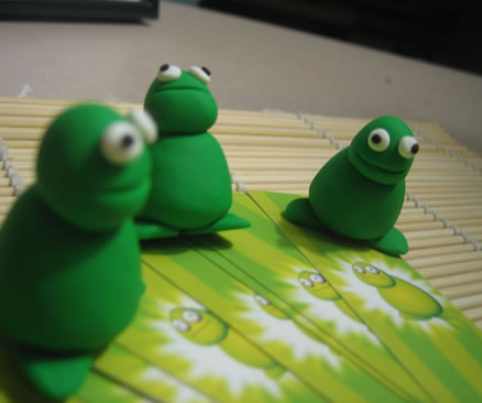
Update: Thanks to Alix for re-creating the little guy from my business cards out of clay. These are freakin awesome, they even have the same retarded bug-eyes as mine :)


Comments
New Comments disabled
Due to the high volume of spam and the fact that I barely update this blog anymore, new comments have been permanently disabled.
I love your bright designs and I also like the idea of having a business card that is not the regular size - it makes it stand out much more.
http://www.template-media.com
Outlining fonts [typically] will add bulk to the fonts on output, making them heavier than they really are (as well as larger files, but thats not too big of a deal). These days, if things don't come back the way you sent them (and you sent them correctly) find a different printer that doesn't screw with your files. All the good printers that I deal with take my pdf's just fine. Embed the fonts and rock on. Color can be a challenge, especially if you don't have print experience. If you are doing a lot of print, invest in the Pantone Process book, which won't be exact, but close enough. I can see where you might have trouble because brights don't produce so well in 4 color process.
At any rate, awesome job on the cards. Lots of fun!
They look somewhat similar to moocards
and surely Business card plays a very vital role in uplifting your business.
I love your bright designs and I also like the idea of having a business card that is not the regular size - it makes it stand out much more.