Matt Inman - 0at.org - Marketing & Design
- ¤Home
- ¤Everything
- ¤About
- ¤Portfolio
- ¤Blog
What I learned about web design from walking around Tokyo, Japan
Posted on 12/2/08
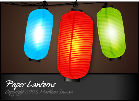
As a design-minded pedestrian, walking around Tokyo was like being force-fed every possible permutation of every possible design idea that ever existed or will ever exist. I was exposed to a (sometimes overly) rich array of light, shape, and color. The paper lanterns above were inspired by a restaurant I saw that had a variety of these hanging in the front of their store.
This guy said it best: androids dream of tokyo. Tokyo's frenzied landscape resembles something out of a science fiction film, not to mention the size of the city. Shibuya crossing alone makes Times Square in New York City look small and quaint, and that's just one district of Tokyo. Imagine Times Square, but in all directions, for miles on end.
Don't over saturate your website
This was one of many pachinko parlors I ran across in Shibuya where the owner sought to fill every square inch of space with eyeball-raping information about their store. Even the floor you walked on was was riddled with ads:
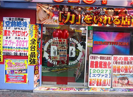
In a city where over-commercialization is so rampant, this parlor is right at home. From a design and marketing perspective, however, this is a shotgun approach: shoot in all directions and hope the spray hits something. This insane approach to creating a storefront is mostly likely the result of escalation. The store down the street used giant fonts, so to compete this store owner added giant fonts. The competitor then added giant pink fonts with tentacled bunny rabbits, so this store owner added tentacled bunny rabbits who sing christmas carols year round and fart out heart shaped bubbles. The end result is two of the ugliest, most confusing storefronts in Japan(possibly even Asia). If this store would take a few steps back and go for a minimalist approach - perhaps a solid black wall with a small bit of white copy, I guarantee it would be more interesting to people who pass by on the street.
ALA has a terrific article on using whitespace, and makes a great point with the following image:
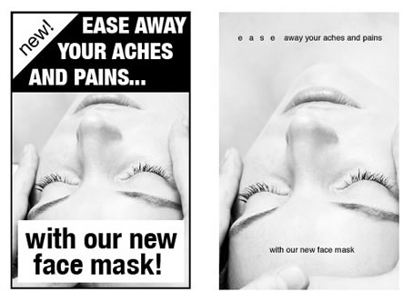
Notice how the first advertisement seems cheap and gimmicky, while the second one incites elegance and sincerity. The copy is the same, it's just a difference in lettering and whitespace. The pachinko parlor could use a similar treatment.
While I'm on the subject, I want to offer a word of advice: If you're ever in a design meeting with a client, avoid using the phrase "effective use of white-space." I've had several clients, who upon hearing me say that, suddenly clung to it like it's the holy grail of effective web design. From then on every page you produce will be subject to their "effective white-space formula," whereby they now have a justifiable excuse for saturating every inch of available space with their brand. Spatial integrity goes out the window and is replaced by an unhealthy dose of eyeball rape.
The Hamburger Wars
I saw this poster for a McDonald's hamburger and had to take a photo:
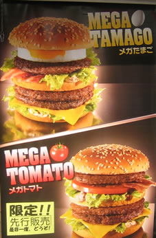
Not only is this hamburger advertised as MEGA, it's also taller than I am, contains 800 strips of bacon, cheese, egg, and fresh ground GODZILLA meat. After seeing this sign, I was convinced this was the greatest burger to ever pass down the throat of man. At least that's what I thought until I saw this:
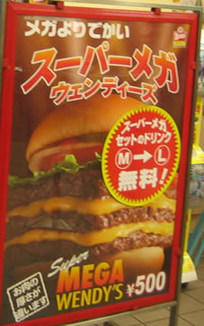
WHAT NOW BITCH! SUPER MEGA Wendy's Burger 2008! I bet McDonald's didn't count on Wendy's coming out with a SUPER MEGA godzilla-meat 1000-bacon-strips burger. McDonald's marketing department is burning the midnight oil now, I'm sure.
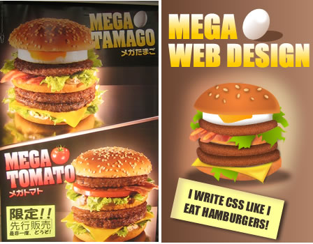
Aside from its ridiculous size, what's interesting about the Mcdonald's hamburger poster is that it shares a lot of properties with designs I create: glowing edges, gradient-colored text, and it's even got a web 2.0 reflection. (although I refuse to use reflections, I think they are the 2008 equivalent of a photoshop lens flare). With this in mind, I drew this vector-based hamburger to promote a fake web design shop.
Zen Gardens
It's no wonder the CSS Zen Garden chose to canvas their idea with such a tranquil scene. If you visit Japan, try and make a trip to Kyoto. Kyoto is a more traditional city full of temples, shrines, and japanese gardens (not so much the tentacle porn and Yakuza). I had the chance to see a few Zen gardens while in Kyoto but up until I actually set foot in one I didn't really "get it." Zen gardens are all about simplicity: often times it's just a few stones arranged simply in a giant rectangular strip of gravel. Where you might find brightly colored flowers or a water feature, in a zen garden you're more likely to find grey pebbles. It's not a bad thing, it's just different. Zen gardens invoke peace of mind, not emotion.
A zen garden doesn't have to shower you with aesthetics to show you something beautiful. When designing for the web, I often become very focused on making a website look stunning by adding all kinds of crazy elements, which when unchecked can result in the occasional failure.
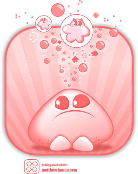
Bursts, pops, and bubbles
The japanese certainly love their cutesy icons and shapes, and I'm not one to criticize. I've now got an arsenal of ideas for various monsters, swirls, and other random poppy shapes. These "bloblets," were something I designed a few years ago, but I feel they're right at home in this post:
I spend a lot of time looking at web design galleries, but I'm also a strong advocate of finding inspiration offline. When I see something highly creative and unique, it's like a little alarm goes off in my head that fills me with the urge to make something. In Tokyo this creative knob was turned up full-volume.
If you want a heavy dose of this Tokyo flavored creativity, but going to Japan isn't in your budget, check out these awesome HDR photos of Japan I found via UberSuper.
About Matthew
I am no longer updating this blog, but you can follow all of my latest work over at The OatmealPortfolio
Web Design, Art, & Other Stuff


Comments
New Comments disabled
Due to the high volume of spam and the fact that I barely update this blog anymore, new comments have been permanently disabled.
I speak Japanese and lived in Japan for many years. Most Japanese (and other Asian) web sites are what we would call over saturated.
Some people argue that it is because it's such a pain to type Japanese text that pages have way more links on them. I think it might be because flashy displays of technical know-how give the sites credibility.
Whatever the reason, what we would call oversaturated web sites are the norm in Japan. If you ever have the opportunity to design a Japanese or other foreign site, do lots of testing because what you know may not apply.
But yeah, don't oversaturate your site...
You say that 'the minimalist approach' would most likely work out better, but I have to disagree with that. I don't know if you have ever set foot in a pachinko parlor but it's a place full of seizure-inducing lights, with music blaring from the speakers only barely drowning out the incessant noise of the machinery (supplying the little balls). People who frequent these places enter a trance-like state and sit there for hours amidst the visual and aural chaos.
A 'minimalist approach' would not only render the place unrecognizable as a pachinko parlor, it would probably scare people off.
If you are looking for more minimalist design, I recommend you'd walk around the more 'upscale' areas such as Ginza and (to a lesser extent) Omotesando.